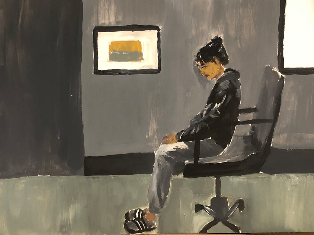
EXHIBITION TEXT
The purpose of this piece is to highlight the societal prejudice women face based on their clothing and self expression, trough the modernization of old artworks. This work is focused on replicating the image of “Madame X” by John Singer Sargent and the piece “Whistler’s mother” by Whistler. It’s focused on conceptualizing the reaction of the public to create a new meaning to my work. I came to modernize both these pieces to represent an issue that has been present throughout history as women are judged by society through whatever they do, specifically through what they wear. All products to create this piece were purchased.
INSPIRATION
John Singer Sargent, "Madame X" 1883-1884
One of the inspirations for this work was the piece “Madame x” by John Singer Sargent. This piece is a piece of a sophisticated woman looking away while grabbing onto her gown. The contrast between her skin and the background along with the space around her being empty allows for the piece to emphasize the individual. It was considered a very controversial piece as the public largely criticized the subject. They said that the piece was too sexual and the woman was showing too much skin. And so my piece is focused on implying the public’s reaction onto a portrait. This portrait is supposed to be identical to the original with a different subject. I wanted to modernize this piece to represent how this issue has existed and is present through artworks from the past onto modern art.
James Abbott McNeil Whistler, "Whistlers mother" 1871
My other inspiration was the piece “Whistler’s Mother” by Whistler, the original work is a portrait of the artist’s mother, originally it was not intended to be a portrait of his mother but of some other subject. The public implied this piece was meant to show respect and gratitude towards the artist's mother. However the artist himself stated he had not created this work with any personal feelings but rather just to explore different techniques and styles which in the end he came to be very satisfied with through this piece. In contrast to “Madame X” the public's reaction differed greatly and could even be said that their reactions were opposite, due to this I wanted to create a piece that resembled “Whistler mother” as well. What I wanted to do was to apply the “modesty” in this piece with an opaque surrounding to represent the sadness within restricting oneself.
PLANNING
To begin planning for this piece I began to gather themes I could focus on and I narrowed it down to a couple I then researched some known works from the past I could take inspiration from to connect with my theme. I was deciding between social issues since I believe this would be a good way to represent the idea that “what is old is new '' considering that many issues that are present today have been existing for a long time. I wanted to show this and thus I decided to work on creating a piece that replicated the judgment against women on all of their decisions.
Once I had chosen my artworks I decided to further analyze them to be able to connect my own piece with the original work. As I researched more of the pieces I was able to come up with the idea of creating a work based on the reactions of the public based on the artworks. I annotated a couple of things I found from the pieces from the technical applications to the overall concept. What I found was that both pieces highly emphasized their objects through contrast of color specifically “Madame X” her light skin in contrast with the dark background and dress was able to highlight her throughout the piece and allow the viewer to focus on her. “Whistler's mother” created a portrait with different shades of gray and I really wanted to connect that with my piece to symbolize the feeling of sadness and restriction.
I began to sketch down some of the main aspects of the piece I wanted to incorporate in my work. I began by sketching my own verison of “Madame X” I knew the final product would not be exactly the same as my first sketch but I knew I wanted a confident pose and gaze that would allow the individual to stand out, I also really wanted to emphasize the clothes so I wanted to make sure that the contrast between the clothes and the background was visible. The clothes in specific I wanted to be tight fitting or slightly revealing while it sitll stil allowed the subject to feel confident. For my version of “whitlers mother” I wanted to have my subject look sad and in an insecure/ awkward position to highlight the pressure put on women to be a cerain way. So I knew I wanted to incorporate a gaze looking down and one that appeared almost “obedient” . I would then want them to be slouching and sitting down to represent a form of insecurities.
PROCESS
picture reference
Before i began to sketch on my poster board I had to take some reference pictures to sketch off of. I had my friend model for me for my "Madame X" modernized version and I advised her to wear something that was slightly revealing but still made her feel confident, I had her pose in different ways other than just the original pose. For the modernized version of "Whistler's Mother" I set up a camera in the same angle as the original work and pressed record and then I hit different poses, I would then screenshot the video in the position I liked the most/ the one which resemble the original better.
sketch #1 & #2
After i had my image references I began to sketch the individuals onto the poster board and I began to do so for my "Madame X" version. I briefly placed shapes where I wanted each portion fo the body to be in and once I had doe so I began to add in the details of the individual, I repeated this process for my second piece inspire by "Whistler's Mother"
|
painting #1 & #2
Once I had the sketch of my portraits done for both of my pieces I began to work on the gouache paint. I began with the "Madame X" piece and I started by drawing the background first before I began to work on the individual. I worked on adding the basic colors and then went on to add a couple of shades and highlights to replicate the contrast in the original piece. I started the other way for the other painting by beginning with the individual before going onto the background. Once I had finished drawing the majority of the individual I worked on the background and for both these pieces the background was for the most part very simple and required little detail however it did have a high contrast on certain parts and required me to work with different shades and blending. For "Whistlers Mother" the piece consisted majorly of different shades of grey which limited my palette to those colors and throughout the process it mainly costed of bending black and white. .
EXPERIMENTATION
proportions
one thing that I had some trouble dealing with at the beginning and which is kind of visible in the final piece are the proportions. in the beginning I kind of just went in to drawing the individual with no guidelines and before it was too late I realized that the proportions were off and so I decide to lay out shapes throughout the board to guide myself where the individual wold be positioned and where certain elements would go. However as I was painting I kind of messed up part of these elements and ended up disturbing some of the "Madame X" proportions which isn't necsarrill y a bad thing but its not as similar to the original due to this. When looking at the final piece and at the original picture some of the body's proportions are off along with the face's however it didn't disturb the piece too much to the extent it was unresemble d to the original.
colors
One thing I had to experiment with a lot were the colors I applied on the piece, because although I was trying to resemble the original pieces I came to realize it was harder to replicate than I had imagined and getting the exact colors whether that was for my image reference or for the inspiration was difficult therefore I began to emphasize on what looked right on the piece itself and not necessarily on how similar the colors were to my references. When comparing "madame X" to the original for example it is clear there are brighter tones surrounding the individual however this came to highlight the concept of confidence within self expression the women was able to represent as the warmer tones set the mood to be that way in contrast to the pique colors of "Whistlers Mother".
water blending
I had never worked with gouache paint before therefore I was unaware of the different consistencies the paint had for every new tube of paint it was a surprise to see the consistency it held. There was a certain color I used a lot for "Madame X" that had a very thick constancy with a to of clumps which made it hard to blend in with other paints and along with that there were some colors which were every runny so dealing with the different consistency's was hard. When applied to the poster board it was hard for some colors to come through whilst others were too visible to the point brushstrokes appeared too harshly therefore I had to experiment with the amour of water I used for the colors in order for the application to be smooth. I also realized that when I tried to blend it was easier to do so when I applied water whilst blending in different shades which allowed for a better contrast in the piece.
CRITIQUE
SIMILARITIES:
Both of these pieces visual composition is similar but not exact. In terms of the position and elements within the portrait, both of these pieces reflect on each other to a higher extent than the similarities between the techniques and style. My piece along with "Madame X" has heir individual gazing off to the side with a clear background focusing mainly on the individual. In my piece I decided to allow my individual to reflect themselves through clothing and appear quite sophisticated and confident in modern terms. both of these pieces apply a certain level of contrast in the background to emphasize the center of the image.
DIFFERENCES:
In contrast to the original piece my piece is lacking detail all throughout the work. Unlike the original piece there is very little realism in both the individual and he background's elements. Apart for that the medium used is completely different thus the application of paint differs. My piece lacks a lot of the elements the original work has. For example there is a higher contrast and difference in tones within both pieces. In the original work the color of background is a lot more brown and less vibrant which allows for the individuals skin to pop out. The clothing used is also very useful for this work as its allows for the individual to be emphasized more. In contrast my piece's background color is similar to the skin tone of the individual and does not resemble to darker tone that the original work presents. The depth of the work in my piece is lacking compared to the original work. When looking at the cloth and the details in the skin along with the props used in the portrait "Madame X" preset more richness in color and thus includes brighter highlights and darker shades which allow for the realism in the piece to show. In the background around the individuals feet the shade is strong and there is very little light which is not present in my own piece the floor is also uneven and messy which just disregards the realism within the piece.
SIMILARITIES:
both pieces mainly occupy shades of gray and create a portrait with monotones in order to form a sense of unity throughout the piece. Both pieces are portraits fo individuals sitting facing a certain way. The original work along with the inspired work occupy space and shape to formulate a form of strictness and cleanliness along the piece. By including an almost empty wall with very little complicated background the piece is allowed to form a feeling of cleanliness and emphasis on the individual. Due to the geometrical value of the piece there is also a form of "strictness" as the balance and geometrical sequence highlights structure.
DIFFERENCES
Even though in the original work the background is very simple and has very little detail there is a lot more depth to he colors included which allowed for a higher sense of realism and 3 dimensional space which is not present in my own work. The work is also a lot more clean in the original, the lines are more sharp and visible in the piece which creates a high richness throughout the work, When comparing the background for example its visible how even the different sections are and how straight and clear the lines are. There is very little highlight in the woman's clothing from the original work as well which is not what I did in my own work. In contrast to the original my work presents more highlights coming from a source of light above which is not what the original intends to do. Along with the highlights the shades in the original work are a lot more visible and rich. In the original work near the individual the shades are more preens despite the lack of light in the setting which really helps the piece create a 3 dimensional space, my piece is very 2 dimensional and flat which includes a very minimal amount of shades and does not help its 2 dimensional space expand to a 3 dimensional space creating realism.
REFLECTION
Overall I wasn't satisfied with the final piece both conceptually and technique-wise. This was my first time working with the medium and it was a new experience for me that allowed me to learn about the different techniques. However my expertise of the medium was reflected on my final piece and it messed up with the professionalism in it making it appear more like a cartoon and unfinished. It was difficult to control the medium in a way it would show through the board and appear clean. When blending in colors due to the different texture it was really hard for the pigments to blend in with each other creating anew color therefore when I applied the point there would be strokes of different colors in the brushstrokes not allowing for a solid base in the board. One of the things I would have done differently in the piece technique-wise no matter the medium would be to start from the background and then move onto the other elements of the piece. I noticed that because I started with the individual in the second piece when I tried to apply the color in the background it was hard to not cover the individual with a brushstroke and I grew afraid of that making me too cautious of the paint around the individuals which then led to a lot of white spots around certain parts of both works. I would also thoroughly mix the colors before applying to make sure that when applied the colors wouldn't cause any trouble. Adding guidelines in the piece to allow me to see where certain shadows an highlights are created I feel like would be very useful to imply more detail in following pieces as well.
I tried to keep my concept simple but strong which is why I tried to clearly and accurately visualize the connection between the two pieces. For both of my pieces the connection between the original and my own work was more of an implied connection rather than an exact connection, this is because the two are connected based off the emotions they create rather than the emotions that are directly applied on the work. So despite the original intents of the original works not being similar to those of my own work there is a similarity of concept through the emotions the works are able to cause in the audience. However I do wish that I could have represented my idea of women empowerment better, and by this I mean that I showed the woman who is all covered up to be sad and insecure, even though this is not always the case. I failed to represent the sense of empowerment through ANY type of expression in clothing and that included women who felt empowered in clothing that covered them up. I was focused on a specific case of women which are ridiculed by their skin showing clothing while i wasn't so focused on the other group of women who feel empowered differently and are still ridiculed by society, due to this I failed to conceptualize my piece to the extent I wish I could have and therefore lacked to show the true intents of my work.
ACT
1)Clearly explain and describe how you are able to identify the cause-effect relationships between your inspiration and its effect upon your artwork.
the cause effect relationship between my inspiration upon my artwork is visible through the visual aspect fo my work, It is clear that I have tried to convert the original artwork into my own by modernizing it whilst still maintaining its original basic structure. The concept of the piece although not as visual is able to connect with the inspiration as it symbolizes the struggles within a community based upon the reactions of the public for both of the original artworks.
.
2)what is the overall approach (point of view) the author (from your research) has regarding the topic of your inspiration
The overall point of view that both artist from my research have regarding the topic of my inspiration, social issues is not clearly stated and is more implied because the artist come from a different era were social issues like the one I speak about in regards of women empowerment were not as often spoken about back in those times when they existed, therefore it can be implied that they did not care about the topic of my inspiration and might have taken part of the community that shamed women.
3) What kind of generalizations and conclusions have you discovered about people, ideas, cultures, etc. while you researched your inspiration.
some generalizations and conclusions I have discovered about through my research of inspiration is that social issues and many struggles can be represented through artwork and be just as useful as textbook information to show the relevance and history of communities that have been struggling since before our present. Cultures will continue to struggle as there will be opposing communities that go against the equal treatment of others, we can only reduce the injustice but not completely erase it as it is a morality that has been lost within humankind way before we could realize it.
4)What was the central idea or theme around your inspirational research?
the central theme around my inspirational research was a social issue/ struggle that I could represent in my modernized version and how it has developed and stayed relevant throughout the years.
5)What kind of inferences (conclusions reached on the basis of evidence and reasoning) did you make while reading your research?
Some conclusions I have reached based on the evidence and reasoning while reading my research is that through art movements and through art styles one is able to collect and analyze the information of certain pieces to gather data and infer the historical beliefs and ideas cultivated from individuals experiences.
BIBLIOGRAPHY
- “Madame X Analysis.” Artble, 19 July 2017, https://www.artble.com/artists/john_singer_sargent/paintings/madame_x/more_information/analysis.
- Schjeldahl, Peter. “Why Is ‘Whistler's Mother’ so Iconic?” The New Yorker, 24 Aug. 2015, https://www.newyorker.com/magazine/2015/08/31/moms-home#:~:text=In%201891%2C%20it%20became%20the,residing%20outside%20the%20United%20States.&text=The%20painting%20represents%20the%20peak,modulating%20tones%20of%20single%20colors
- “How Whistler's Mother Became an American Icon.” Widewalls, https://www.widewalls.ch/magazine/whistlers-mother-american-icon.