This project was a collaboration with MIAD in a summer internship they held for the summer of 2022 for two weeks in the end of june. In this internship me and another student were guided by 3 mentors, Tess Lacey, Bridget Greuel, and Luis Tejada from the Engberg Anderson Architects firm. This internship focused on exploring the different aspects under the field of architecture through a project focusing on the design and significance of space around us. The goal of this project was to create a plaza located in the parking lot of MIAD, essential components to be included were a pavilion and a sculpture garden. My idea is primarily focused on creating a green community space where different individuals from all background can interact and approach the space which would evoke a sense of comfort ability through its construct and natural components. We worked with sketch up primarily in order to create our final idea digitally.
planning + inspiration + process
The main inspiration for this final piece is Timothy Wolosz. One of the principals of the Engberg Anderson Architect Firm where this internship took place in. He's one of the architects who designed the public space besides the MIAD apartment buildings where I took inspiration from his incorporation of nature into space. More specifically the seats which utilized trees as a component of its structure. After hearing from him talk about his projects and how he applies value to a space, through his way of incorporating elements that serve for a specific purpose, I was able to grasp a new perspective of how space impacts an individual's feelings and how significant a component can be to the use of others, whether if it's for technical or aesthetic purposes.
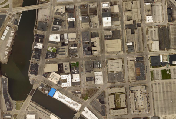
The first couple of days were dedicated to analyzing the area where the space we would focus on was located. To do so we walked around the Historic Third Ward where the MIAD and MIAD parking lot took place, we focused on analyzing some of the architectural and design components of the different areas, and what we could create and incorporate in our own designs with what we noticed. One of the things I noticed about the Historic Third Ward is how the name implies, the area is heavily focused on historical architectural components, a lot of the buildings in use are revitalized buildings, so a lot of the designs from the buildings have intricate designs which contrast from a lot of modernized buildings in cities. A lot of the material used as well heavily incorporate red bricks, concrete, and hints of blue metal. From walking around one of the things I was heavily influenced by was the incorporation of nature into space. Next to the MIAD apartments there is a space where students can sit and interact with others, and in that space there are seats that have trees coming out of them and can be used as a form of shade during the summer and are able to create a sense of comfort for individuals. So apart from its aesthetic purpose it has a practical purpose which I thought was really interesting and thus would be included in my piece. While we walked around and we had the mentors talk about the purpose of things and as I analyzed them myself I came to a deeper realization of the strong correlation between space and emotions, I came to understand that there is a big influence between how a space is created to how it allows individuals to feel. Implying there is purpose everywhere we are in. The image below is able to show where the project took place and the surroundings of the area. The blue block shows the area we would be working with and some of its closest surroundings include the river, the river walk, apartments, gym, coffe shop, and the MIAD building.
The images below come from a google slides presentation I created towards the end of the project to show everything I used to formulate my ideas. In this specific slide I show the major components I wanted to include in my plaza. I focused a lot on the components of the ground in the beginning of the project. There was a significant amount of elevation so I wanted to work around that and make it a part of the components in my piece. To do so I decided that I wanted to include stairs and with that there would be seating combined with it so I could make best use of the space and allow for people to have the option to choose which way to utilize the area. As we had walked around the surrounding areas I was very interested by the interactive components of spaces such as guides through the ground leading people to a certain place or simple images to provide for aesthetic purposes. I wanted this plaza to incorporate some of that essence which explains the middle upper image where the fish path is shown. Throughout the area I wanted to allow the people to have the choice to navigate through different areas while being guided, and I really wanted the people from the street and the people from the river walk to connect so therefore I would included a pathway specifically designed to connect both sides while expanding it to the rest of the area. This was very significant as it allowed me to create a sense of movement within the area.
For my pavilion I really wanted to included a clear ceiling with a circular structure because I thought it was more organic and would connect better with the naturalism heavily utilized in my space. Just like Timothy Wolosz incorporation of nature into structure I wanted to include a big centerpiece to the area in which both the street and river-walk people could connect. This would be the pavilion where I planned to have a tree come out with seats surrounding the tree as seen in the lower right corner image. I then wanted the walls and ceiling to surround this sort of centerpiece where the sculpture would be included within. I wanted to utilize the ceiling as another component to further highlight the importance of the pavilion. Since it would be one of the most private elements of the area I wanted to allow for some form of publicity to be included and this could be done through a clear ceiling as seen in the lower left corner and lower middle images. Other additional seating areas such as the benches seen in the upper right corner image show could be included as well in order to provide for more options to the public about how they approached the space.
The images below are to show some of the optional yet essential components that could be included in the space. Lighting as seen in the upper corner images plays a big role in creating a mood in a piece specifically during night and I think it's essential to include this in the space because it would allow for easier navigation and it gives people the option to interact with it for different time periods. The bottom images are all to show how I wanted to use the walls provided by the space. One of the walls I was heavily focused on was the really big MIAD wall. I wanted the wall to represent MIAD students and their creativity which would also allow other people to notice and be attracted to the space. I was initially thinking about having a permanent mural, however I believed that by allowing for the mural to change every year created by the student of MIAD would further highlight the idea of art and changing ideas, it would also be refreshing to view different art and would allow for the students of MIAD to form a tradition within their school. I also wanted part of this wall to be interactive so I wanted part of it to be chalkboard so that the public could express their own creativity on the wall and this would also allow for more people to be attracted to the space, and a more diverse audience. It would also allow for a different mood to be created apart from the calm mood that the rest of the place provided. To further develop the option of a fun mood in the space I thought of including additional components such as the swings seen in the middle upper image. These additional components however still had to match the general theme of the rest of the space in order to be utilized by the people who would mainly interact with the space, in this case being mostly adults. I was initially planning on including a playground for kids in order to be more inclusive but that would interrupt the rest of the space and what it aimed to provoke therefore I thought that I could include some swings such as the image which were more relaxing and mature than a typical playground.
The images below show some sketches of components that I wanted my space to incorporate. The image in the upper left corner shows my inspiration for this space. It's an image depicting what the benches looked like that incorporated the trees within its structure and other additional elements surrounding these benches such as the vegetation growing off the concrete walls pressed down by some form of grid. I thought that this was very interesting because of how vegetation was able to grow out of an unlikely space. I think the color contrast between the gray, the green, and the metal also went along very well. The other images following to the right in the top are sketches of how I planned to create my pavilion. Due to the rest of my space being very organic, I wanted to maintain this essence throughout and decided to keep my pavilion in a circular shape as seen below. I was heavily influenced by symmetry and wanted to incorporate this in the pavilion. To further highlight the connection between the space and nature I would utilize a tree as a centerpiece to be coming out of the pavilion in the middle. I would then have seats surround the trunk of the tree and include different pathways leading to a door to go outside. The place besides the doors inside the pavilion would then be used to place the sculptures, by allowing the sculpture to be inside the pavilion I would create a contrast between the outside public space and the private space within the pavilion to further highlight the importance of the sculptures. I wanted to utilize the structure as much as I possibly could so I wanted to include more seats outside the pavilion that were part of the structure as seen in the middle image below. After coming up with a brief idea of its structure I began to think of its materials and I knew that I wanted it to be made out of wood to further highlight its naturalism. One of the other things I began to think about was the ceiling. I wanted to utilize the ceiling to create a different mood as well. Lighting in a place can really affect how it evokes feelings for people, by allowing there to be openings in the ceiling where light was able to hit the sculpture I would create a warmer feeling that would also highlight these sculptures. However I did not want the entire ceiling to be open so I wanted to still include some solid ceilings that would be made up of the material of the walls. In order to balance out the openings from the walls to the openings from the ceilings I would have the opening in the ceiling align with the closed walls in the walls and vice versa this would allow for some symmetrical and contrast to be Incorporated. The images below in the lower section of the slideshow are used to show the rest of the components to be included. The image in the left bottom corner shows how I wanted half of the floor to be used because of its elevation change. I wanted there to be different options and different uses of the space by incorporating stairs and seating with a clear pathway they could choose to follow or not. I also thought that by incorporating art within the furniture included would be interesting as the space used is primarily for art students. I found unique furniture that could be included throughout the space, to fit the unique aura to be presented in the space. additional and optional components such as the interactive spaces including the playground and swings were sketched in the other pages in the bottom. All of these additional components i think would bring a lot of personality to the space and allow for others to use in their own way. I think that by including these as well people would be more attracted to coming in. I also wanted the pavilion to light up at night along with the floor so that people could see and navigate through the night.
The following slide shows more of the process to begin formulating my own space. I began to work more with floor plans and making everything proportionate to the space in real life. I began creating a bubble diagram as seen in the lower left corner of the image below. Just like my reference image I wanted to include that elevation change into the upper part of my space where the street is located walking into where the pavilion would be located in the middle which would then branch out to different seating areas and areas of the space. I wanted to include bike racks on both sides of the space along with an attractive piece on both sides such as the pop up shop where the street side is and a swing area where the river walk is. I wanted the pop up shop in the street side because I believed that people walking especially students could quickly grab something from the shops and interact with the space and then move along with their day while the swings would allow for people walking from the river walk to sit down and relax while exploring the rest of the space which could then lead them to view different amenities in the surrounding area. This was a general bubble diagram that I had sketched out, however in the middle column of images as seen below I used a map of the space with sketching paper to begin thinking about proportions in the space. The first sketch paper floor plan is softer/ general compared to the rest and includes a lot of highlighting how there would be movement in the space/ how people would navigate the area. The image below begins to depict my idea more clearly with different colors portraying the difference in material/ section. however I began to finalize my idea in the bottom sketch. The left side of the map is from the street while the right side is from the river walk, I wanted there to be 3 paths provided on both sides of the area with a more organic pathway that would not be a straight line as initially planned because it was too different from the rest of the components of the space. The three paths on both sides would essentially lead them to the three different sections I created in the space. In the left column of the slide I present the final idea I had come up with and where each component would be located. So basically for the final idea in a sketch I have some form of elevation throughout half of the area beginning from the street. I created a path in the middle connecting the street side to the river walk and have two additional paths people can walk down to the rest of the area. One which includes a ramp while the other consists of regular stairs. On the side of the street on the left there would be bike racks while on the right there would be a pop up shop. On the wall on the left there would be vegetation and lights throughout the rest of the floor to guide people during night. The stairs would be made up of bricks while everything else would be grass, except the concrete path in the middle. The other half of the area would be where the pavilion and sculptures would be located at. There would be two paths coming out from both sides of the pavilion leading them to the river walk and on each side of the pavilion there would be benches and amenities to explore. For example on the right side there would be a chalkboard wall that would go below the MIAD mural which allows the public to express their creativity in a temporary way as well. There would also be swings in the right corner where people from the river walk could also easily access. On the left side there would be vegetation which would also include seating and paths to look through the garden, along with bike racks accessible to the public.
After completing the sketches and floor plans and generalizing an idea of how I wanted the space to look in general I began to work on digitally composing the space with the use of sketchup. While doing this I had to begin to think about the in real life proportions of the space and components using up the space. I began by working with the elevation and floor paths so I could get that out of the way and just work on creating the components that would go on the space. Due to the fact I had never worked with sketch up I was very new to all the tools and took really long when trying to level out the floor. After much trial and error and discussing with my mentors I created the floor separately and then inserted it to the space which made it a lot easier and i proceeded to do this with the other components such as the pavilion seating, swings, amenities, etc. After doing such I began to add color to the area to be able to distinguish the areas and their use in the space. Due to the fact we had such a time limit and such little experience with the digital tools I wasn't able to present my idea to the best extent I could have possibly done it with and there were some additional components to add but I was generally able to show where I wanted and how the overall space would be composed.
experimentation
When working on the paths of my space I noticed that i began to drift from its geometrical structure to a more organic structure in which I had follow along the movement of the rest of the space and its components. This also allowed for people to explore the space in a more carefree way as seeing the curving paths might allow for them to think they have the option to not move strictly around the space. Along with this I explored the organic structure of the elevation seating/ stairs I used in the space, instead of the geometric structure my inspiration showed I began to develop an organic structure with some form of symmetry by having stairs on each side of its structure but with different sizes. AS i began to work on the pavilion and other of the amenities as well I began to think a lot about their use and how people would explore those components. For the pavilion I knew I wanted to incorporate nature within its structure and I knew I wanted seats to surround the tree trunk, because I wanted the rest of the structure to fit along this idea i built the pavilion around the tree to kind of represent how the tree is the one providing the shelter allowing me to emphasize the idea of the importance of nature in space. Other amenities such as the pop up shop and the swings were thought about before being finalized in the space. the pop up shop was originally going to be a coffee shop but because there was one in front of the space it was decided to become a pop up shop where it could constantly change vendors and come through different seasons, this would also benefit many small business.
When I began to work with sketchup i knew it would be difficult because I had never worked with it before and I am not a person who is very fond of digital tools since its too complicated for me. One of the most difficult things I had to work with when creating this space was composing the floor and working with the elevation of the space. It was really hard to do so because I wasn't used to any of the tools and I wouldn't use the tools properly and then my product would not come out the way I would think it would come out. Another thing I began to find difficulty with was the size of my pavilion. I had initially created it larger than it should have been, and I only noticed this after placing the pavilion on my space, and noticing how larger it looked compared to the other components of my space. I had to look at spaces in real life and their sizes to create a pavilion that would make sense to the rest of the area. It was really hard to create the paths as well because as I had mentioned before I wasn't used the tools of this software so the paths would not show up on my space because when placing the lines they wouldn't connect to the right spaces and it was just more complicated than it should have been to finally be able to show through.
critique
There are a lot of similarities between my space and my inspiration since I based off the main idea of this space off of my inspirations major component. One of the strongest similarities between my inspiration is the way that they incorporate nature into the structure of a component. My inspiration incorporates the tiny trees within the seats wile my space also incorporates nature into different of my components such as the elevation, pavilion, seats, etc. Another similarity is how they both use materials to contrast the use of each part of the structure. For example my inspiration uses wood, and copper to contrast the seats to the back support, the simplicity of the copper along with the more intricate design of the wood just goes well together which is important to understand in terms of how material can be used in a structure. In my space and specially in the pavilion I use different materials for different uses within a space. For example the clear ceilings, and the paths made out of concrete, in contrast to the red bricks stairs, etc.
One of the differences between my inspiration and the space I created was that the incorporation of nature into my structure is used as both functional and aesthetic purposes. I wanted to utilize the larger tree almost as an attraction for the public leaving them wonder what was within the space that the tree covered. It's also used as a way to provide shelter/ shade and seating in the area. My inspiration largely being the seats of the MIAD apartments, utilize the tree more for its aesthetical purposes within the seats rather than a functional purpose other than providing shade when they have leaves during the summer time. Another difference between these two is that my inspiration is more geometric while mine is more organic. my inspiration has a rectangular structure with the rest of its components being geometric as well, while my space for the most part is heavily influenced on organic structures.
reflection
I believe that this internship allowed me to develop my idea of architecture and further developed my understanding of the essence of creating spaces. I obtained a lot of knowledge of the real world and how spaces impact individuals. I also developed a higher understanding of the educational and professional process of becoming an architect. I became a lot more interested in architecture after this internship. I began to understand how every element In a structure is made with a certain purpose and how w can manipulate a space in order to evoke certain feelings. I came to understand and become much more interested in the field of architecture as I highly enjoyed working on this project.
I don't think I was able to represent all of my ideas clearly because I wasn't able to manage through the software as easily I had initially imagined. however I think that my idea could have been worked on a lot more, and I wish I could have had more time to work on this. Ate receiving all the feedback and collaborating with professionals to demonstrate my ideas I was able to gather different insights under this field. Apart from the specific architectural skills I attained from this project I was also able to intake some other skills that I then utilized in my day to d life. I was ale to find a higher sense of security for my future as I began to develop a passion for architecture. I also began to understand my intentions a lot better and developed my social and presentation skills a lot more.
ACT questions
1)Clearly explain and describe how you are able to identify the cause-effect relationships between your inspiration and its effect upon your artwork. The cause effect relationship between my inspiration and its effect upon my artwork can be seen as I largely incorporate nature and significance into the elements of my space. Much like Timothy Wolscoz my space uses nature as part of an element to the structure of the piece seen through the tree in the pavilion, the use of vegetation in the floor and other additional organic elements included. 2)what is the overall approach (point of view) the author (from your research) has regarding the topic of your inspiration Timothy is the one who influenced the design of this space and therefore has a strong understanding of the topic. He was also there when we were presenting our work and mentioned how he believed that the idea that everything is designed a certain way for a certain reason is a valuable thing to understand to further comprehend the significance of architecture.
3) What kind of generalizations and conclusions have you discovered about people, ideas, cultures, etc. while you researched your inspiration. I have discovered that everybody navigates through a space differently based on different factors and everybody will experience an area differently based upon how they navigate through their day to day life, different components of a space can impact the way people live their life and their moments within that space. Many spaces can often reveal a lot about an individual community or a culture because of what everything represents in their day to day life.
4)What was the central idea or theme around your inspirational research? the central idea or theme around my inspiration was to be able to create an area which anybody could interact with and somewhere people could feel comfortable in and at peace. I wanted it to be a community space where people could enjoy of nature and sculptural pieces.
5)What kind of inferences (conclusions reached on the basis of evidence and reasoning) did you make while reading your research? i made the conclusion that there's different ways to evoke different feelings and each component in a space is required to contribute to the purpose of that space, I believe that it is essential to understand the purpose of space in order to understand the human behavior in a place.
cites
“ .” Engberg Anderson Architects, https://engberganderson.com/.