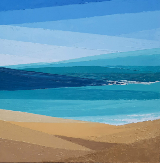
exhibition text
This piece aims to experiment with a different art style and incorporate a different medium to my artwork in this course.All products are bought and the piece is inspired by Olga Brovkencho’s artwork. I wanted to show the significance everyone has on each other and reflect upon the value of a life. I got my first real job this summer and I was feeling kind of hopeless throughout summer. I was finding difficulty in identifying who I am as a person and what I value and what my life values to others, I kind of felt insignificant and overall very lost. However, as I began to working the summer I kind of came to the realization that we all impact each other's lives and being in the spotlight does not define success or value, I came to further understand that all the roles played in an act are what creates the scene.
inspiration
My inspiration for this piece was, Olga Brovkchenko's artwork. I attempted to interpret her minimal and clean art style into my own work. Her piece "Blue" is a part of her series "colors of earth" from 2021. this series is focused on allowing the viewer to see light and calmness inside themselves, which is also very connected to what I wanted to portray in my own work in a more specific way. She primarily focuses on shapes and colors to portray her idea. I was really drawn to the strong and clean lines she's able to create which still allow for her to form a landscape despite its geometric qualities. Going into this piece I knew I wanted to focus on emphasizing a clean and concrete idea which is what led me to be inspired by this style that Brovchenko is able to illustrate in her own work. However despite how clean her lines and shapes are I found it interesting how she's still able to illustrate the material through its thickness and texture placed on the canvas. when looking throughout the piece if you focus on the edges and even in between the areas of the shapes you are able to see how there is a thick amount of paint applied on the canvas which creates another form of texture and also allows for the piece to be throughly filled up. I also really liked how she incorporated those tiny bits of highlights in her piece by placing white brushstrokes along where it was needed and I really wanted to incorporate all of these aspects onto my own piece as well.
|
Olga Brovchenko, "colors of earth: blue" 2021 |
planning
To begin this process I began to reflect upon my summer and what I wanted to convey primarily. I figured that my mentality had changed a lot compared to when summer began and I think a large part of that was getting a new job. As small as it might seem to others it became significantly important to me because it allowed to develop a better understanding of who i am as a person and my value as an individual, I was surrounded by really mature people and was able to step out of my comfort zone by doing things such as taking the bus, socializing with co workers, having to be nice to rude employees, doing 5 tasks at once, and all of those small things in a sense made me feel like I was worth something all of the customer's compliments or my co workers made me feel as if my life had value at least in some way to them, which made me realize whether i was an employee or a customer no matter which side of the story I was telling, I was telling a story and I was a part of it, all of those small interactions that impact everyone won't happen with one individual it requires more, being surrounded by people and finding the joy in that and finding the joy in thrill is something I was able to rediscover about myself after i had lost it for so long and it mad me view life in a different way, which is why i wanted to paint this job, in order to show that idea of value in life and rediscovering confidence. Because it was such a specific and personal idea/story I had to share I wanted to convey my piece in a very minimalist and clean way to be able to be interpreted easier by others.
At first I was thinking of creating my piece with pen or pencil and either do a graphite drawing or dot drawing with pen however I wanted the medium to signify something to my piece, to do so I was thinking about painting my job with oil paint because oils tend to dry slower which would also convey the idea that this job has made such an impact and the lessons learned will stick with me. At first i was thinking of doing a piece where I would draw an interaction between an employee and a customer to tell a story, in the outside at first glance the piece would just seem as if its a normal insignificant interaction however I think there was more beauty to that and there would an underlying message that can be interpreted in different ways because at the end of the day everybody has different values and therefore their interpretation and significance of a piece is different dependent upon their own experiences. however I thought that by drawing myself as both the employee and customer would be interesting and allow for more open interpretation because it'd leave more questions to the audience since it appears more abnormal. However after I had taken some reference pictures and visualized how the piece would look that way I concluded that I just wanted to draw the place alone because it was just more significant and simple to what I wanted to show. I'm often and over-thinker however I was able to minimize this through my job experiences and I believe by keeping the piece simple I would further portray my idea.
process
To begin this process I had to take some reference images of my job i took some from an angle more up above and directed towards the register. I then took some images of myself in the register as an employee and as a customer because at this time i was still thinking about going with my original idea however after visualizing the idea with the images i thought the simplicity of the image of my job alone was more than enough to convey my message. After choosing my image I then had to lay a grid on the canvas along with the image to proportion. I began by applying a grid on the image and then adjusting it to fit on the canvas. To do so i applied a 3 x 3 grid on the image and then for the canvas I just went ahead and applied a 3 x 3 grid as well. After this I just began sketching the image onto the canvas through the grid method which I don't usually do, quickly after this was done I began to paint.
original idea/ unused images
final reference images on canvas
I began to paint the register and then worked around it but as I was looking at it I noticed the colors for the register were off and too bright so I had to cover it up with a more accurate color, and the overall piece was just too messy and I was unknowingly blending in the colors so I had to completely disregard everything I had done and clean it up because it looked blurry and dull. This was the most time consuming part as I had already put in some time to paint the other version I had to basically unused, but after this I tried to maintain as much of a clean look as possible. After I had fixed it up I decided to focus on the rest of the piece which was a lot more detailed because it included a lot of small aspects like the bottles in the fridge, the chairs, the bar, the signs, etc. once I had completed this I just painted the edges of the canvas and then focused on cleaning up some of the mistakes on the piece and I finished.
before and after cleaning up
experimentation
blending
There was a lot of experimentation going into this piece because I find I was unaware of many the techniques and skills used to create a lean and minimalist piece because I went in trying something completely out of my comfort zone because I am not one to paint in an “organized” way and i usually tend to just paint whatever i see on the canvas and less often do i refer back to the original image to see what i'm actually portraying on my canvas. I found that i was blending in the colors trying to create depth in the objects without even realizing it and when i went back in to look at the piece overall I would notice how dull and blurry the piece would end up looking. I wanted each section of the piece to be distinct which is why i decided to just make another attempt to separate these sections and I went back in to clean up the piece.
one of the other things i was having difficulty reproducing were the colors of the image because when i applied them to the canvas sometimes they would look opaque and wold not lay on the canvas smoothly and it would just look patchy. I figured that when i blended in colors with each other the consistency of the paint would be more thick and therefore it would go on the canvas a lot better, and the edges produced would be a lot more clean.
the canvas I was working on was significantly small for some of the details of the image to be painted clearly with a brush, and i tried multiple times to create these images on the canvas but each time I would just make it more difficult for myself so i found that when I used other mediums such as a pen or a marker to include these small details in my piece it would look better and so I found this interesting and thought of ways I could Incorporate it in future pieces.
critique
similarities
Both of these pieces explore the concept of individualism and value in certain things. They represent this in similar ways with their style and medium. Brovchenko tries to illustrate the idea that a landscape can be beautiful and she tries to illustrate the individualism and peace one can find within admiring such space around us. While Brovchenko's work is much more minimalist and geometric my piece tries to replicate that through its incorporation of clean lines and no blending both of these works use color and shape in order to create form without the need of blending.
differences
In brovchenkos piece the medium is almost used as another form of style. She uses thick amount of paint to spread on her canvas in order to create a texture in her piece allowing more dimension to be introduced within the work. In my piece I just use the medium to create the piece but I don't use it as part of my piece so its a lot more flat than Brovchenko's work which is primarily one of the reasons as to which the lines are not as clean as they could be in my piece. Another major difference between both works is that Brovchenko's color pallet is a lot more limited compared to mine and less detailed than mine. Despite both being really similar conceptually, they both serve for specific and different purposes. My piece is focused on telling a personal story demonstrating growth while Brovchenko's work was created more from universal perspective while she appreciates the beauty of nature and its impact on individuals.
reflection
Overall I am happy with what I have created because I feel as though I genuinely tried hard to produce my piece and stepped out of my comfort zone to display a piece made with a style I am not familiarized with. there could have been different approaches to the piece which could have allowed me to display a better product. For instance I could have been more precise with my shapes and included more geometric elements to further connect with my inspiration. I was also thinking about including lighting, I feel like if i had been able to manipulate the piece in order to use lighting and include almost like a ray of sun hitting a specific part of the piece I could have further showed the importance of the place with a sense of light symbolizing peace and happiness. Looking back I also think that if I could have sketched the piece to be almost like a coloring book where I placed shapes and lines of certain colors to create forms then it would have been easier to develop a cleaner piece more resembling of Brovchenko's artwork. I noticed as well that the piece was very small used to what I usually create so it was harder for me to illustrate small details while still making them appear clean. If i were to do it again I would have tried to make the piece bigger because I also really liked the concept behind it so I think its just too small for my preference and maybe even experimenting with some poster qualities and putting on paper would have been interesting to have done as well. Regardless of all of the visual aspects of my work and the technicality I think I was able to express my message precisely and reflected upon my experiences. There's still so much to learn and experiences as the days go on, there's still a lot for me to learn and I am aware I will not precisely ever know it all however this piece has allowed me to explore another part of who I am and what I can become through its concept and through the exploration of its medium and style.
ACT questions
1)Clearly explain and describe how you are able to identify the cause-effect relationships between your inspiration and its effect upon your artwork.
the cause effect relationship in my piece based on my inspiration can be seen through the attempt in clean and individuals shapes/ lines in my piece just as Brovchenko does in her work "blue" its also identifiable through the similar concept of individualism and peace within oneself.
.
2)what is the overall approach (point of view) the author (from your research) has regarding the topic of your inspiration
the point of view Brovchenko has on my topic is pretty similar to what I think based off what her work is focused on, because she focuses a lot on landscapes and showing the beauty of simplicity which is essentially what I'm trying to say when I tell my story of my job and what I learned.
3) What kind of generalizations and conclusions have you discovered about people, ideas, cultures, etc. while you researched your inspiration.
I have discovered through my research for inspiration that people tend to use their styles and mediums to also show an idea in a piece and its not only what's presented aesthetically but what lies underneath the visual aspect of a piece that truly conveys its purpose and value.
4)What was the central idea or theme around your inspirational research?
the central idea was to show the value of an individuals life on a bigger community with some more meanings such as individualism and rediscovery of confidence, I think however the piece is of course up to interpretation I created it to tell a story but everyone can read it in different ways.
5)What kind of inferences (conclusions reached on the basis of evidence and reasoning) did you make while reading your research?
I have discovered that people tend to convey a purpose and idea in a. certain way while the viewer can interpret it entirely differently.
sources
- Olga Brovchenko, https://olgabrovchenko.art/artworks/colors-of-earth/.